

Goals
- Understand what customers want, what makes a successful product, and how new stations might alleviate demand in different geographical areas
- Understand how the current line of bikes are used.
- How can we apply customer usage insights to inform new station growth?
- The customer growth wants to understand how other users (subscribers and non-subscribers) use our bikes. We’ll want to investigate a large group of users to get a fair representation of users across locations and with low- to high-activity levels.
Seasonality
This tab of the dashboard focuses on seasonality, or trends throughout the year, with the Trip Totals chart and the Trip Counts by Starting Neighborhood table.
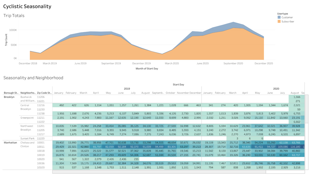
Trip Totals chart
The Trip Totals chart illustrates the bike trip trends from 2019 to 2020, categorizing users as customers or subscribers. The chart highlights that a substantial portion of Cyclistic’s user base comprises subscribers, indicating a strong loyalty and commitment to the service. Additionally, it reveals a higher number of users during the warmer months (May-October) compared to the colder months, aligning with the expected behaviour of reduced bike usage in colder weather conditions.
To create this chart, the Start Day was aggregated by month and placed in the columns field, while the sum of Trip Counts was used in the rows field. The UserType was utilized to assign colours, allowing for a clear differentiation between customers and subscribers.
Trip Counts by Starting Neighborhood table
The Trip Counts by Starting Neighborhood table displays the number of bike trips initiated in each neighbourhood between 2019 and 2020. It provides a comprehensive overview categorized by zip code, borough, and neighborhood. The table employs a colour gradient to highlight the highest and lowest monthly trip counts, with darker shades indicating more significant trip volumes. To ensure readability and accessibility, lighter text is used on darker values.
The starting location is crucial for targeting advertising efforts, indicating where users seek bikes. The table reveals that the Lower East Side, Chelsea, and Clinton neighbourhoods have the most active bike stations. Moreover, the months from May to October exhibit the highest activity levels.
To create this table, the Start Day dimension (aggregated by Year and Month) is placed in the Columns field, while the Borough Start and Neighborhood Start dimensions are included in the Rows field. The sum of the Trip Count measure is utilized for setting colour and labels in the respective fields, allowing for comprehensive and informative visualization.
Summer trends
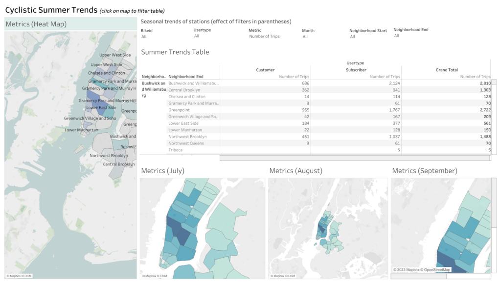
The first tab of the dashboard showcases a map displaying seasonal trends of bike trips across the New York boroughs. The main map provides an overview of all the boroughs, while a table compares the number of trips and average trip duration for customers and subscribers in each neighbourhood. Additionally, three smaller maps highlight the months of July, August, and September, which experience the highest bike traffic.
This interactive map offers various filters to narrow down the data based on bike IDs, user types, metrics, months, starting neighborhoods, and ending neighbourhoods. By applying any of these filters or clicking on a specific borough in the maps, the table and maps dynamically update to provide a more detailed focus on the selected criteria.
Top Trips
The third and final tab of the dashboard presents a comparison of the total trip minutes based on the starting and ending neighbourhoods for both customers and subscribers. The tab includes two horizontal stacked bar graphs, each ordered from highest to lowest number of minutes, combining the data from customers and subscribers.
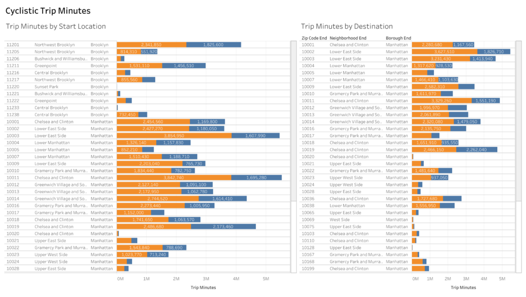
These insightful charts highlight the locations users are most willing to travel long distances to. It is evident from the charts that the Lower East Side, Chelsea, and Clinton neighbourhoods have the highest total trip minutes for both starting and ending stations.
To create the starting neighbourhood chart, place the sum of Trip Minutes in the columns field and the Zip Code Start, Neighborhood Start, and Borough Start dimensions in the rows field. Assign colours based on the UserType. Repeat the same steps to create the ending neighbourhood chart, using the Zip Code End, Neighborhood End, and Borough End dimensions.
Summary
From the dashboard, we gain the following insights about users and subscribers and season trends:
Users and Subscribers: The Trip Totals chart reveals that subscribers make up a significant portion of Cyclistic’s user base. This indicates a strong loyalty and commitment to the service. Understanding the user composition helps tailor marketing and engagement strategies to cater to their needs and preferences.
Seasonal Trends: The Trip Totals chart also highlights the seasonal variation in bike trips. It shows higher user activity during the warmer months (May-October) compared to the colder months. This insight aligns with the expected behaviour of reduced bike usage in colder weather conditions. Recognizing these seasonal patterns enables better resource allocation, planning, and decision-making.
Starting Neighborhoods: The Trip Counts by Starting Neighborhood table provides information on the neighbourhoods where bike trips are initiated. It reveals the most active starting locations, such as the Lower East Side, Chelsea, and Clinton neighbourhoods. This insight helps identify areas of high demand and optimize bike station placement and distribution to meet user needs effectively.
Combining these insights about users and subscribers and analyzing the season trends, Cyclistic can develop targeted marketing campaigns, optimize resource allocation, and enhance user experiences to drive business growth and customer satisfaction.
Dashboard link: Cyclistic